Training load.
Acute over chronic, the only ratio that actually predicts injury risk. Plotted against your target zone so you know when to back off.

FEATURE · PROGRESS & INSIGHTS
Four charts that tell you whether this block is working and what's changing.
Free for 30 days. Then €9.99/month or €69.99/year. Cancel anytime.
Acute over chronic, the only ratio that actually predicts injury risk. Plotted against your target zone so you know when to back off.
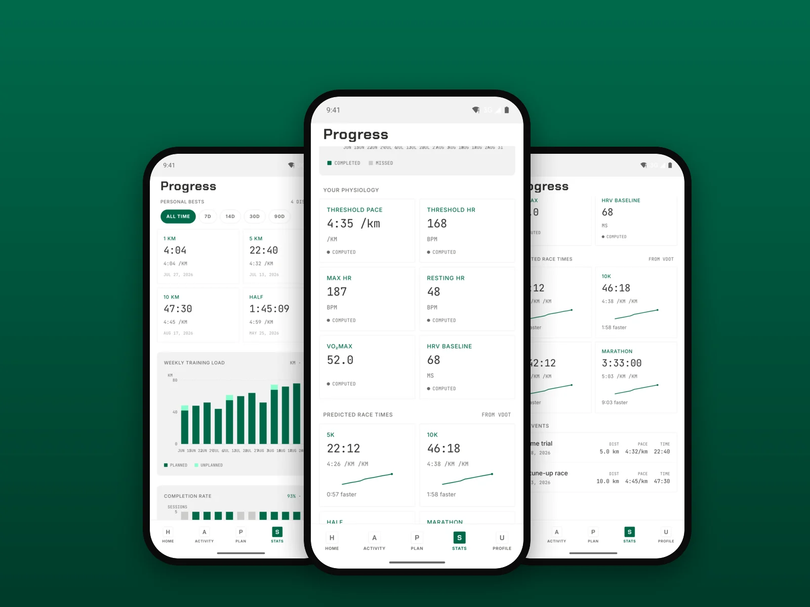
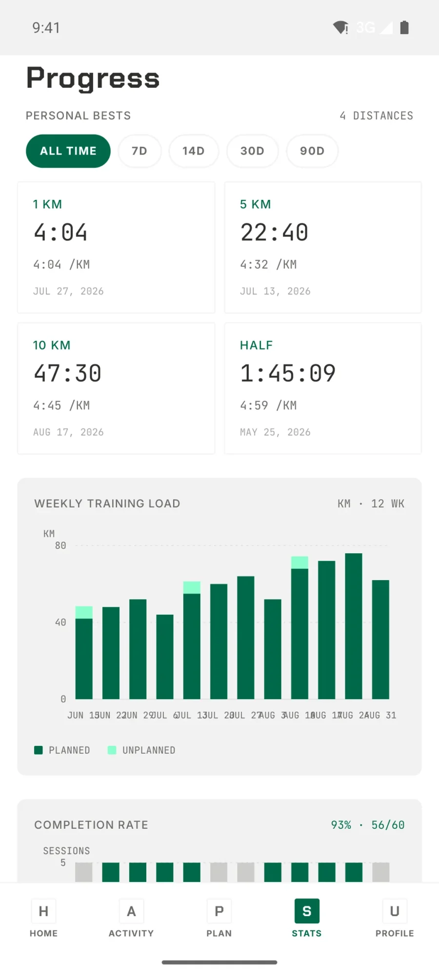
Per week, per block, across your history. If your completion rate drops, the plan treats that as a signal — not a failure.
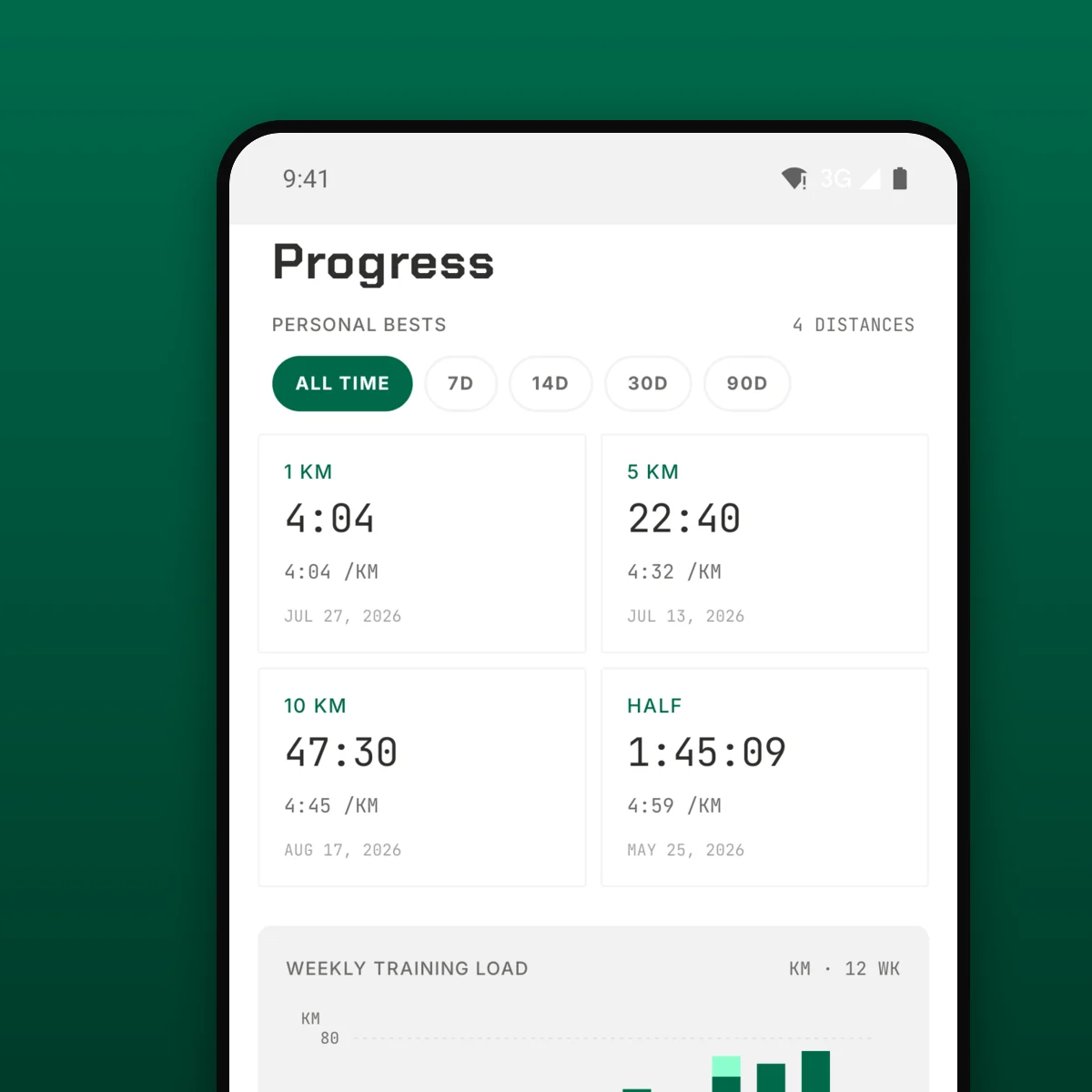
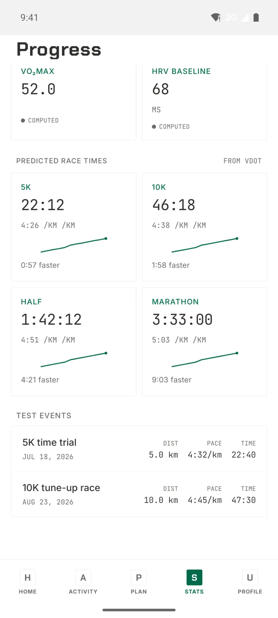
Your fastest times, but also the trend line. A new PB tells you something. A PB followed by three weeks of flat performance tells you more.
The plan schedules test sessions at pivotal moments. You see the result alongside what it meant for the plan — paces tuned, zones shifted, volume unlocked.
PROGRESS
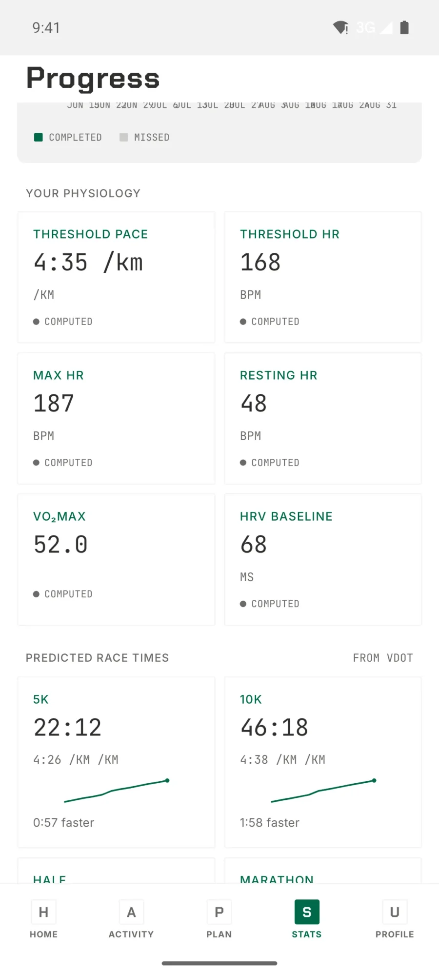
Personal bests and weekly load, the physiology underneath them, and what that predicts for race day.
WHAT WE MEASURE
Progress in TrainPlan is measured by the four things that decide how the block ends:
Those four say whether the training is working, so those four are the ones we put in front of you.
FAQ
Yes, as CSV, at any time. Your activity log belongs to you — the export includes every session, every adaptation, every rationale entry.
Yes — the adaptation engine reads it. A rising acute:chronic ratio above 1.5 triggers volume protection in next week’s plan.
In the app. The weekly banner spells out what moved in the plan and why, every time the adaptation runs. If you’d find a weekly digest by email useful too, tell support — that’s how we decide what to build next.
Yes. Open any past block in the history and the current chart overlays it. Useful for seeing where you are relative to the last marathon cycle, for example.
SEE YOUR SHAPE
Thirty days free. The dashboard starts making sense in your first week.
Free for 30 days. Then €9.99/month or €69.99/year. Cancel anytime.
Ready to switch?
We use cookies to optimize your experience on the website, analyse traffic on our website and to show relevant ads to thirds. Read more about how we use cookies and how you can customize your preferences by clicking on “Settings”. If you agree with our cookie policy, click "Accept all”.